Expert class Type design
Online edition 2024–25
The Expert class Type design will be given a mixed formula this year: we supplement our online lessons with an intensive four-day program in Antwerp, packed with in-person lessons, guest lectures, study visits and social activities. The online formula is undoubtedly attractive for our international students, who will themselves save a lot of travel and hotel costs. Thanks to the four days in Antwerp (21–24 October 2024) the students will get to know each other better, while learning about the unique collection of type-foundry materials that are preserved in Museum Plantin-Moretus.
Taking the course online implies that research in the reading room of Museum Plantin-Moretus is not possible. To get around this, students will receive high-quality photos and scans of punches, smoke proofs, matrices, and prints from the museum’s large collection.
The Expert class Type design 2024–25 course consists of a four-day program with lectures and study visits (21–24 October 2024), and nine online sessions given between November and April. The aim of the course is to help students explore and analyze the historical and technical (production) aspects of type and typography, to teach them how to design type in detail, to help them develop an in-depth understanding of the digital font-production process, and to support them in gaining control over related software.
An important aspect of the course is the direct exchange of knowledge and experience between the students. This exchange is stimulated by a type-revival project on which the students must collaborate. The revival is always based on unique historical material from the renowned collection of the Museum Plantin-Moretus. In addition to participating in the revival project, each student must personally design a new typeface, whether it be from scratch or a revival that is, for example, also based on material from the museum’s collection. The course is concluded with an exhibition that takes place annually in the museum (July and August 2025).
The EcTd course is taught by type designer, font producer, software developer, and Senior Lecturer Dr. Frank E. Blokland.
Requirements and admission
The EcTd course is targeted at graphic designers who have a great interest in type and typography. The course is very much internationally oriented and the students come from all over the world. Hence the lessons are taught in English. For entering the course, experience in graphic design, combined with basic drawing skills and knowledge of graphic-design software such as Adobe Illustrator, are considered a prerequisite.
The course provides a good alternative for people who do not have time or the opportunity to follow, for example, the Type & Media master course at the Royal Academy of Art in The Hague (KABK) or the master course in type design at the University of Reading. However, in the course of time a number of students who already hold a Master degree in type design from aforementioned institutes joined the EcTd course.
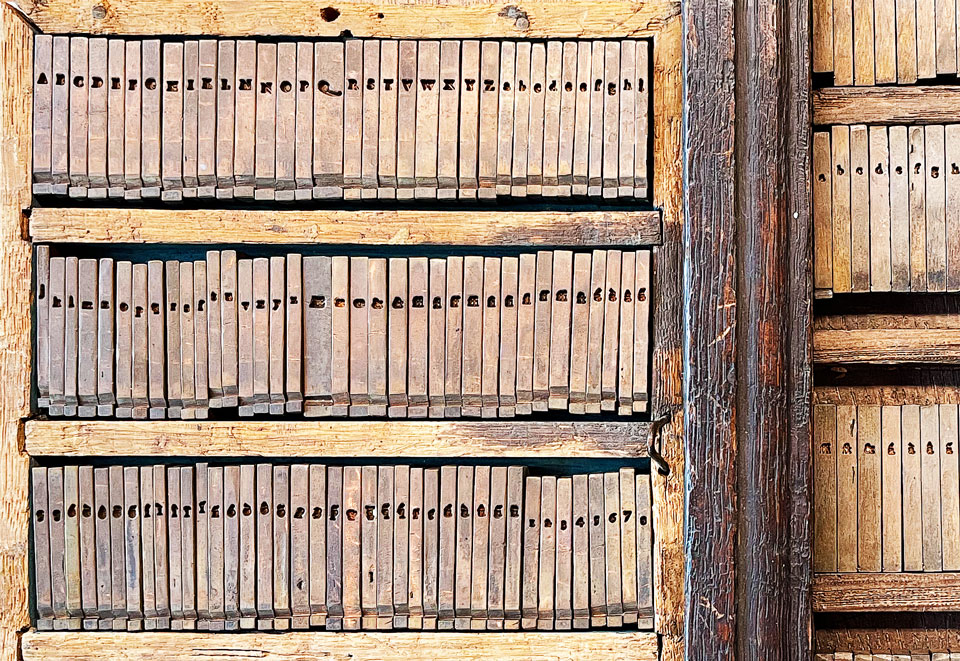
Matrices of the Ascendonica Cursive by François Guyot, kept in the Museum Plantin-Moretus. (Photos taken by Krassen Krestev)
Four-day program in Antwerp
The morning sessions will be lectures from Frank Blokland. In the afternoon, we will have guest lectures, study visits or social activities.
Monday 21 October:
- Morning session: Frank Blokland, in the museum classroom;
- Afternoon: Lara Captan about Arabic calligraphy and type design;
- Free time and social activities.
Tuesday 22 October:
- Morning session: Frank Blokland, in the museum classroom.
- Afternoon: guided visit to the Museum Plantin-Moretus;
- Demo: printing on the wooden press;
- In the reading room we will look at a number of matrix sets and punches, selected by Joost Depuydt, curator of typographical and technical collections.
Wednesday 23 October:
- Morning session: Frank Blokland, in the museum classroom;
- Afternoon: Joran Proot, museum classroom;
- a show-and-tell with books from the Museum;
- Exercise: the typographical evolution of books between 1500 and 1650.
Thursday 24 October:
- Morning session: Frank Blokland, in the museum classroom.
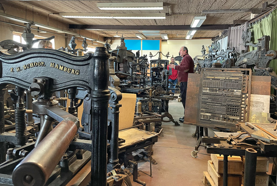
- Afternoon: visit to the workshop of Patrick Goossens in Wilrijk;
- Tour of the collection of iron hand presses from the 19th century;
- Explanation about the Benton engraver;
- Printing demos: demos of the Linotype, Monotype and type casting.
Program, end terms, and diploma
During the first half of the course the students work together online on a revival based on the invaluable historical material, i.e., punches, matrices, foundry type, and prints, from the collection of the Museum Plantin-Moretus. This revival forms the basis for an intensive exchange of insight, perception, and technical know-how between the students, often via collaboration tools like Slack.
During the second half of the course the students have to design and to technically develop a new typeface. Initial sketches and proposals are usually already made and discussed during the first half of the course. The joined revival and the personal typeface have to be presented in two different booklets with an accompanying text on the process and progress. Evaluation criteria for the personal project are: the depth of the study, the insight in the matter, the aesthetically and technical quality of the produced type, and the originality of the design project.
Students who positively complete the course obtain an officially recognized post-college certificate.
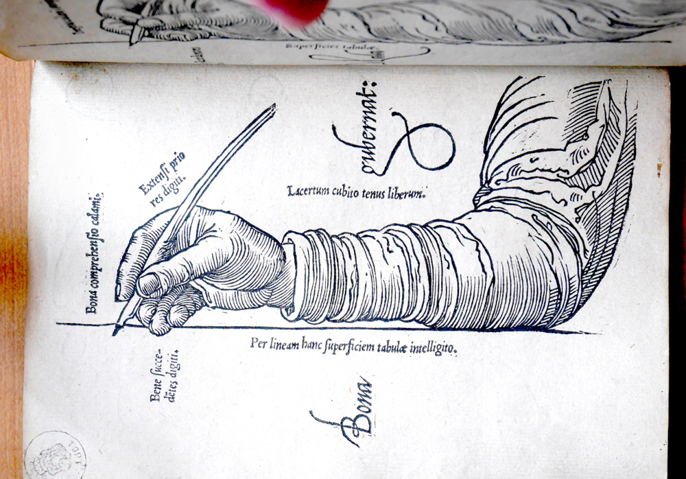
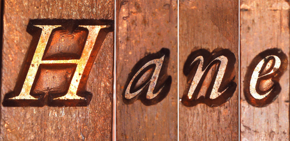
Mercator’s Literarum Latinarum. (Photos by Oscar Rothe)
Subjects investigated
– with related research questions
1. Type, typography, and conventions:
What are the restrictions of the systems inherited from the times of foundry type, i.e., with characters on solid rectangles? What do we know about the factors that influenced the proportions and details of the archetypal roman and italic type models? What is the relation between letterforms and typographical conventions? Where do the conventions for present-day digital typography come from?
2. Form, proportions, construction, contrast-sorts, and contrast:
What forms the origin of the proportions, shapes, and details of the historical and modern typefaces that are in use today? Why and in what respect do characters from the style periods differ? What is the relation of type and typography to architecture, sculpture, painting, and music? Which methods can be used to classify type? How and to what extent are the type classifications of, for example, Maximilien Vox and Gerrit Noordzij comparable and overall useful? What is the relation to matters such as contrast-sort and contrast of, for example, serifs?
3. Type design, idiom, and revivals:
What distinguishes one type designer from another? Why and by what features do we recognize and distinguish the type designs of, for example, Garamont, Granjon, Eric Gill, Hermann Zapf, and Jan van Krimpen? What is a revival exactly? How should historical prints be interpreted? How and to what extent should a revival be standardized and adapted to present-day digital technology?
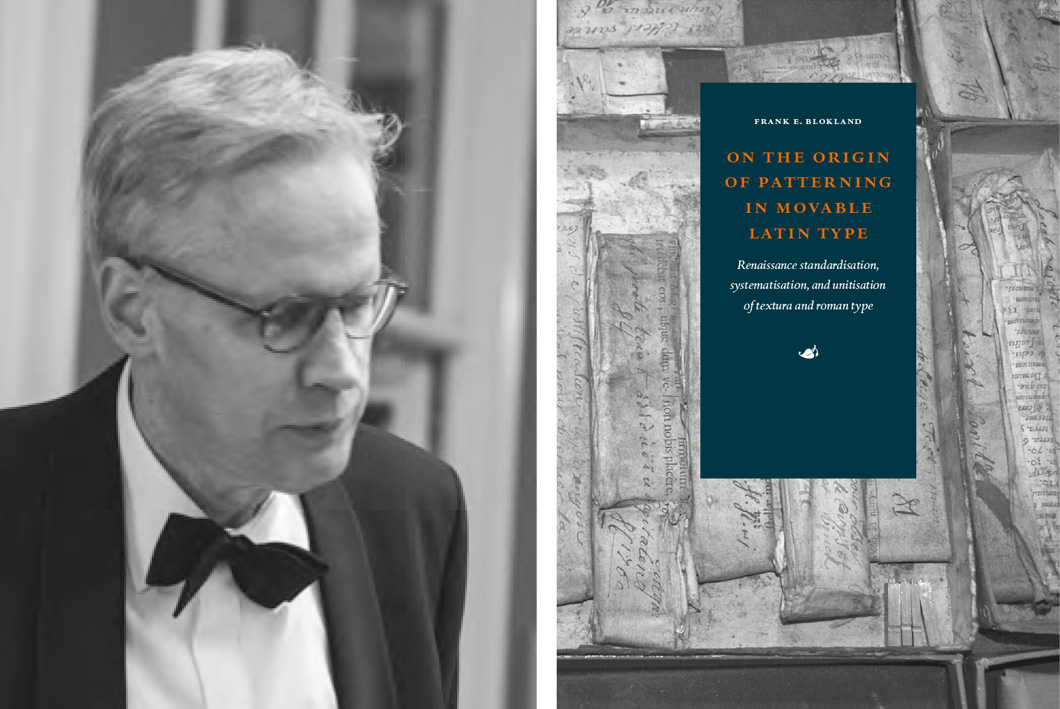
Blokland’s PhD-research at Leiden University, which was conducted to test the hypothesis that Gutenberg and his peers developed a standardized and unitized system for the production of textura type, which consequently was extrapolated for the production of the morphologically related roman-type model, plays an important role in the course. The students use the outcomes for further investigation of Renaissance type.
Digital technology: matters and software discussed (summary)
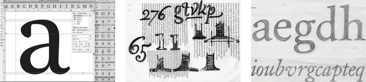
1. Manual conversion of analogue drawings with a digitizer/lens cursor (IKARUS format) or via autotracing, versus direct drawing on screen.
2. Contour description and font formats: the IKARUS format, cubic Bézier curves (PostScript Type1 / OpenType CFF) and quadratic Bézier curves (TrueType / OpenType TTF).
3. Font-production tools: Glyphs, RoboFont, FontLab Studio, FontForge, FoundryMaster, OTMaster.
4. Glyph databases: development of the glyph set. The construction of character sets. The support of multiple codepages. The (auto) spacing of type.
5. Data management and quality control: checking and improving the consistency of font data.
6. Font-format processing: the (batch) generation of kerning, OpenType Layout features, and hinting.
Required equipment
EcTd students will be working together with their computers, running macOS, Windows, or Linux. They are provided with font production software in the form of demo and open-source versions. Furthermore some analogue equipment is required: drawing and tracing paper (A4 – 120 grams), propelling pencil (maximum 0.5 mm) with hb or b leads, an eraser, black felt-tip pens (round head, various thicknesses), Stanley knife cutter, adhesive tape, 30 cm ruler (0.5 mm increments) and a broad nib (preferably a Parallel Pen with a 6 mm nib).
Lessons are in English
Lecturer: Dr. Frank E. Blokland
Calendar: A four-day kick-off event and nine online sessions, on Wednesdays.
Kick-off event: Monday 21 October till Thursday 24 October 2024, from 9.30 a.m. till 4.40 p.m.
Online lessons in 2024: 13 November, 4 December and 18 December
In 2025: 8 January, 29 January, 19 February, 12 March, 2 April and 23 April.
From 11 a.m. till 4.40 p.m.
Location: Museum Plantin-Moretus, Vrijdagmarkt 22, 2000 Antwerp, Belgium, and online via Zoom.
The reading room of the museum is open on week days from 9.30 a.m. till 4.30 p.m.
Enrolment fee: € 1950
Enrol by filling in this form or by sending an email to plantin.instituut@antwerpen.be